A multi-currency wallet, fiat and crypto in one place, trying to unify the two worlds while providing a feeling of safety through familiarity.
Lead Product Designer · Research, UX, UI, Product Strategy · Mobile
Enfineo
In brief
The brief the client came with was clear: bring fiat (everyday money like the euro) and crypto together into one simpler place. What that should actually feel like was the open question, and it got answered the same way from start to finish, with research before opinion.
- Worked as
- Lead Product Designer — UX Research, UX Design, UI Design, Product Strategy
- Designed with
- Ixperi — 1 other Product Designer, a Manager, software dev team
- Observed in
- 50+ interviews across 4 phases · 20+ design sprints · 2,500+ screens iterated in Figma
- Built for
- Mobile
- Now
- No longer active
The premise was to bring fiat and crypto into one place. The people using it wanted them kept apart, on purpose.
Research came before opinion: 50+ interviews, a competitive teardown of 50+ apps, and repeated testing. The design followed the evidence, not the brief’s assumptions or anyone’s preference in the room.
Across 50+ interviews, users prioritized security over innovation, sticking to trusted, familiar methods. Financial compartmentalization mattered specifically because it reduced perceived risk. Keeping money in labeled, separate places wasn’t a UI preference; it was a risk-management habit. On the crypto side, the assumption that people would want to spend crypto like everyday cash didn’t hold either. Most treated it as an investment, prioritized maximizing gains before ever cashing out, and trusted non-custodial wallets (where people hold their own keys) and established players (Binance, for instance) over new entrants.
Research surfaced five recurring segments, from loyal, tech-hesitant Traditionalists to multi-tool Modern Spenders and Financial Optimizers, to Crypto Newbies and deeply literate Tech Enthusiasts, spanning very different relationships to risk, tools, and crypto itself. A competitive analysis of 50+ fintech apps and crypto wallets, plus a running research repository in Dovetail, backed the pattern up beyond any one interview.
Three early concepts were tested, each drawing the line between a person’s assets a different way.
Users preferred keeping things apart. The real design problem was reconciling that preference against the product’s own reason for existing: a simpler, unified way to manage money. The direction that resolved it kept Banking, Crypto and Products distinct, but connected under one account.
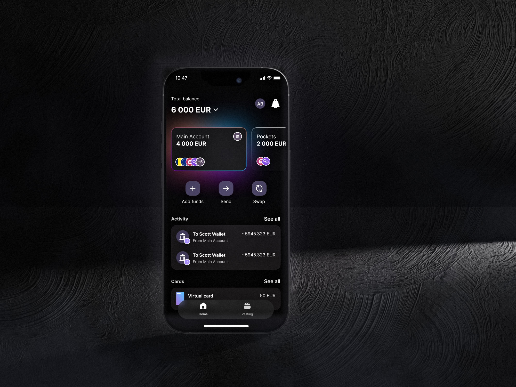
Main Account & Pockets
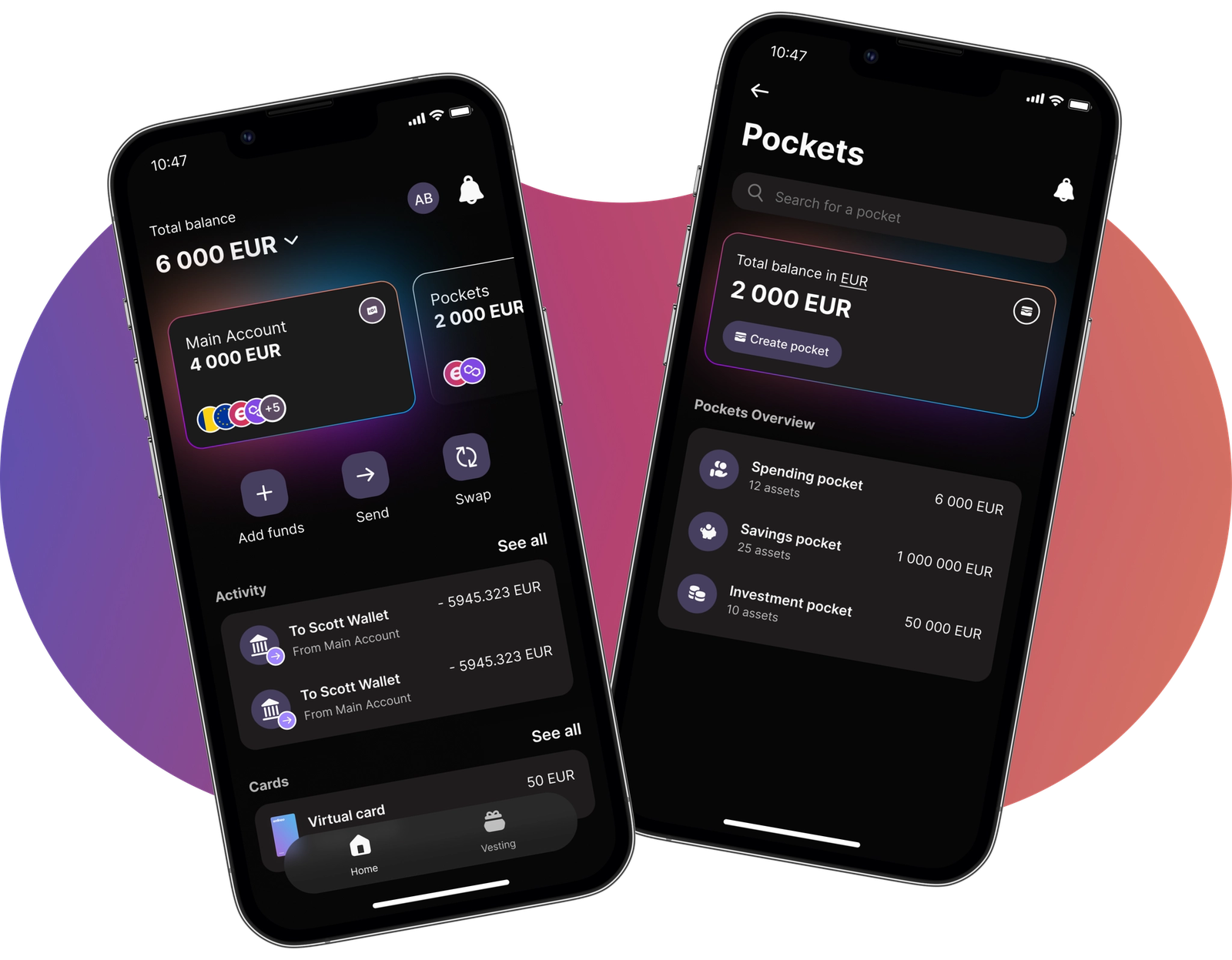
Pockets were the resolution: separation preserved at the level users cared about (purpose, risk, mental accounting), unified at the level the product needed underneath.
Main Account for everything received. Pockets for everything set aside on purpose.
Four iterations moved from a tabbed Banking / Crypto / Products structure down to a single split, the one thing a visitor now has to understand.
See more detailsHide details
How the model got that simple
- 1st iteration
- Banking, Crypto, and Products competed as top-level tabs, with favorites, recent transactions, and a borrow-against-assets feature all fighting for the same space.
- 2nd iteration
- Pockets were introduced, but layered with extra separation: a Main pocket and a Spending pocket, still nested inside the old tab structure.
- 3rd iteration
- Tested and tightened: Main Account and Pockets started to read as the top-level model, with multi-currency holdings (EUR alongside MATIC, the token of the Polygon network) visible together.
- Final iteration
- Main Account and Pockets became the only two things a visitor needed to understand. Everything else (cards, swap, activity) hangs off one of those two nouns.
Three pocket types shipped: Spending (fiat or crypto for daily spend, linked to a card), Investment (crypto held separately, for tracking growth), and Savings (goal-based, automated, flexible withdrawal).
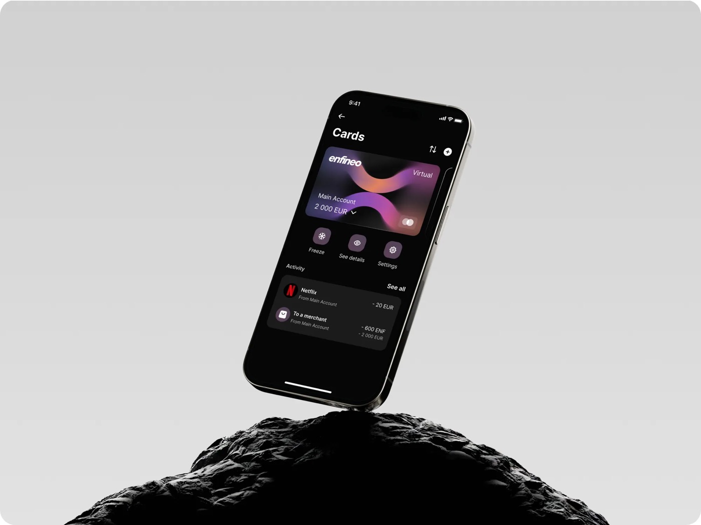
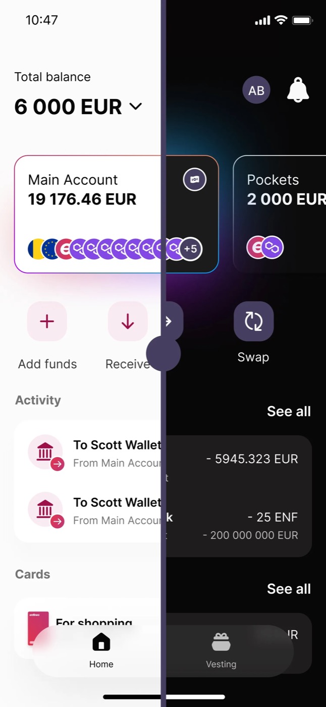
Enfineo’s own brand, the pink-to-purple gradient, stays as shipped. The team moved beyond the original brand palette deliberately, testing several directions before landing on this one.
Designing trust into Proof of Funds
A required verification: to continue, people had to hand over sensitive financial information and documents.
The design problem was less about the upload itself and more about everything around it, how to anticipate the moment it would be needed, explain clearly why it was happening, and offer enough reassurance around security for someone to feel comfortable sharing something this personal.
The worst version of this is the one nobody sees coming: a verification wall that appears out of nowhere, with no sense of why it’s there or what to provide. So the flow was built to arrive early and explain itself, rather than to block first and justify later.
Introducing it before it blocks: what proof of funds is, which documents are accepted, how to upload them, and the review statuses that follow, so the requirement is understood before it’s ever demanded.
The complete flow, end to end: from the prompt on the main account, through choosing the source of funds, a suggested document, the secure upload, and the verification status that follows.
This experience reached research and design but was not implemented before the product was discontinued.
Staying in sync, without always being in the room
The team wasn’t always in the same room, or even the same time zone. Staying aligned took a couple of deliberate habits, not just good intentions.
- Weekly rhythm
- A short call opened the week to set priorities together, and another closed it to confirm what actually got done. That rhythm kept the whole team in sync and stopped anyone from quietly spending days on the wrong thing.
- Recorded, not just presented
- Instead of narrating every piece of work live, I explained it in detailed screen recordings: visual, and asynchronous by design. The client could watch on their own time and reply with feedback whenever they actually had time to think.
30,000+ joined the waitlist, and Pockets were what stood out.
3,000+ became an engaged early community around the ENF token (Enfineo’s own token). Pockets specifically stood out to beta testers for the control it gave them over spending and saving.
Making the case for the core product over crypto-backed loans.
The client wanted crypto-backed loans, using crypto as collateral, built alongside the core product, despite users not asking for it. A BNPL (buy now, pay later) flow was partially explored before the redirect. Through testing, competitive research, and direct conversation, the case was made to focus on core functionality instead.
The process itself shifted three times (waterfall, then tailored design sprints, then tighter alignment with development sprints near MVP, the minimum viable product), and in hindsight, that sequencing was right, not a misstep. The first version needed to launch fast to keep the project financially viable, with a large team suited to waterfall’s clear roles.
Pockets let people keep their money where their heads already kept it: apart, on purpose, and readable at a glance. Sometimes the most unifying thing a product can do is respect a separation.
A photograph of mine, just below ↓